Elevation
Elevations serve as the foundational layers of the UI, providing a clean slate upon which various UI elements can be placed. It is important for creating visual hierarchy, depth, and clarity within a user interface. It guides user attention, improves usability, and enhances the overall user experience by providing feedback, organizing elements, and maintaining consistency in branding.
We create different surface levels, for each layer that a component can be placed. The elevation consists of background colors and shadows. Meaning a background surface should be used together with a shadow surface token to create more depth.
Types of Elevation
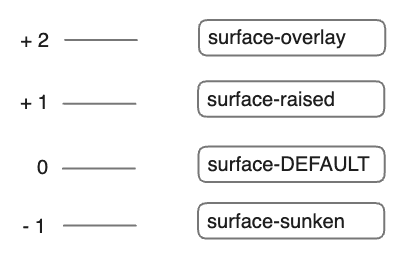
We support four levels of elevation.

These elevation levels are important for creating visually appealing and user-friendly interfaces, as they help users understand the organization and hierarchy of content within an application or website. By using different elevation levels appropriately, designers can improve usability and enhance the overall user experience. Starting by the lowest elevation level, the types will be explained in the following.
Sunken
The deepest surface level we support is sunken. Sunken surfaces should only be used to the default surface level. Avoid applying sunken elevations to raised or overlay elevations.
The token you need is bg-surface-sunken and this should only be used together with shadow-surface-sunken which has a value of none because on sunken surfaces shoulnd't be a shadow.
Sunken
Sunken is the lowest elevation available. The sunken surface creates a backdrop (or well) where other content sits. Columns on a Kanban board are a good example of the sunken elevation.
sourceDEFAULT
The default surface acts as the ground-surface level. It has no visual lift and should be the starting point of each page. This can be for example the <body>.
The used token is bg-surface together with shadow-surface which will also be none.
I'm surface default and fill out the whole page
read more about me hereRaised
Raised is one level higher than the default surface. It will be used for example on <Card>s. The intent of raised surface elevation is to make certain elements stand out more in the design, showing that they're more important or prominent.
The token used is bg-surface-raised and should be used together with shadow-surface-raised. The shadow creates a higher hierarchy from the ground level.
Raised
Raised elevations sit slightly higher than default elevations. They are reserved for cards that can be moved, such as Jira issue cards and Trello cards. In special circumstances, they can be used for cards as a way to provide additional heirarchy or emphasis.
sourceOverlay
Overlay is the highest elevation used for elements that appear above others, like modals, dialogs, menus or popovers in general. Overlays can stack on top of other overlays.
The used token is bg-surface-overlay and should be used together with shadow-surface-overlay wihch creates a shadow to display a higher hierarchy.
Usage all together
In a common layout the surface default is always the ground base for other elements. You should take use of it and avoid excessive use of raised and overlay elevations. Make sure to use the shadow tokens correctly with the background tokens.
In this example all elevation levels are shown in a full page example layout. The surface default behaves as the ground-surface, with the sunken and raised surfaces for creating a visual hierarchy. Overlay surface will be on elements like Popover.
